PROJECT OVERVIEW
Redesign the Homepage of the Coop App
Coop have tasked the Lobyco team to redesign the homepage of the Coop App within a 5 day design sprint, providing competitor research and a more fresh and modern homepage visual design. Their goal was to ensure that offers were displayed throughout the homepage.
As this Design Sprint was held in Danish, I only took part in day 3 & 4 to assist with the UI Design, where you will see below my experimentation of designs and final outcome.
Lobyco Design Team
Myself – UI Designer
Jacob – UI Designer
Caitlin – UX Designer
Karina – UX Designer
Sara – UX Designer
Lotte – Customer Integration Lead
Coop Key Stakeholders
Coop Dk Digital Board
Process of UX Team
During the first 2 days of the design sprint, the UX designers gathered research around target audience needs, creating 3 profiles of customers that would shop on the Coop app, as well as conducting competitor research to discover the user experience of other Danish and international retail apps.
Process of UI Design Team
During the 3rd and 4th day of the design sprint, Jacob and myself worked together to design variations of the homepage app based on the findings of the UX team, as well as requests from the Coop stakeholders. I worked as the creative designer, creating the layouts and designs, whereas Jacob put my designs into a design system. We collaborated very closely with the UX designers to ensure that what was needed was executed through our work.
In these examples, I experimented with how we could display categories. Coop insisted we kept the bubbles, so I chose the direction towards the right so, ensuring design is still fresh and kept in brand. I also mocked up a few banner ads which are present on their current site, and reformatted for mobile
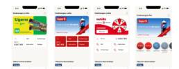
Coop wanted to ensure that the Bonus and Prime Account sections were separate to the categories, and therefore created separate components above. Here I explored how to display these boxes, whether they would be different colours, without icons or content stacked ontop of each other.
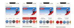
Here I wanted to explore how we could encorporate an image header, which would change according to the time of the year as Coop does currently on their app. I experimented further with the design of Bonus and Prime Account boxes, and what it would look like if a user did not have a Prime Account. The order of components was still unsure at this point, whether to first show banner ads, or categories. We would conduct a user test for this.
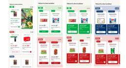
An important part of the homepage was displaying offers, so I explored ways of how product cards would look like. Coop wanted different sections for each Coop branch (such as Kvickly or 365), therefore not only used their logo to highlight this, but their brand colours too, using light background colours, branded CTA’s and coloured cards to bring our their branding.
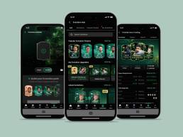
Version 1 Chosen Design
See to the right the video of the first prototype, displaying all the categories, the offer card designs and articles.
Regarding the offers – I went with the more simplistic and clean design, as I didn’t want the branch sections to be overwhelmed with different, strong colours, as this could look quite heavy on the eye if many offers are displayed.
The current Coop app has a feed for its homepage, but nothing is categorised. You would see a range of articles and recipes all combined with no order, so it was evident that this needed some order. For now, we only have an inspiration and local store section, but this would change in the future when we know more what to categorise.
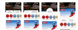
Version 2 Chosen Design
Here we have the same design as Version 1, but without an image header, giving it a more clean and minimal look, and placing priority of banner ads with discounts and personal offers.