The Brief
Create a design system to reflect The Olympics' new brand strategy.
Olympics have recently developed their brand strategy to be human centric, but their digital experience does not communicate their new brand values. We were asked to bring their new brand to life with a new design system and website to reflect this.
The new branding had been designed for print and their digital experience was not taken into account, leaving the website feeling static, clinical, sterile and formal.
The aim is to improve engagement within the olympics between games ‘flame to flame’, make their site more modern and youthful, targeting ‘convenient conversationalists and encouraging users to act on their interests.
Key Stakeholders:
Mariya Kutmanova – Senior Manager, Brand Strategy
Jenny Deiana – Product Strategy
Sagi Chaitas – Senior UX Manager
Raluca Dan – Brand Manager
Mark Carubia – Head of Product
This Place Team:
Elliott Holman – Design Director
Jess Sarsfielf-Desai – Project Manager
Sophie Kakoulli – Product Designer
Marina Mylonadis – Junior Product Designer
Phase 1
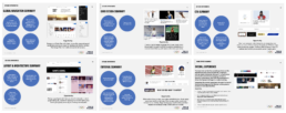
Discovery Phase
For the first four weeks of the project, we conducted the discovery phase which consisted of 3 parts.
UX Audit
We conducted a UX audit of their entire site and mobile app and identified a range of opportunities where their brand strategy can be brought out into the design.
Benchmarking
We conducted a cross sector benchmarking of direct and indirect competitors, pointing out features and elements that are relevant to their strategic ambition.
UX Audit
We identified several areas where the website was lacking their new brand strategy and identified opportunities for each one before going into more detail about the UX and UI, e.g people centricity. Athlete pages are too formal and impersonal and they can go further in humanising athletes and sports.
Then went into the experience audit. Uncovered a broad range of UX and UI issues:
– Navigation and architecture e.g missing headers
– Editorial e.g long titles
– Layout
– Inconsistencies
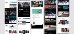
Cross Sector Compare & Contrast
We looked at both near field examples such as London Marathon, Red Bull, F1, and far field examples such as the BBC design system, IBM and a Chanel campaign. There was not a single example that does things perfectly but we focused on elements that are relevant to the Olympics and its strategic ambition.
Interviews
The objective of the interviews was to unpack the current digital experience on web and app to identify what’s working well and what needs to evolve. We asked questions around the current digital experience, the design system process and drew out aspirations and ambitions.
Experience & Design
"I don't know if they get what they expect but they certainly don't get what they want"
Design Process
"We need to review the whole process, it's a pain point for everyone"
Strengths & Opportunities
"The unique history, brand and ethos of the Olympics needs to shine through design"
Ambition & Success
"I just want to feel like it's alive, a living thing that evolves every second..."
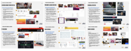
Route 1: Tactical
UX improvements and fixes of the current website, reductions of white space and layout order and predictability.
Route 2: Takeover
Purposeful use of space, more immersive and dialled up, and we see key moments brought to the front.
Route 3: Immersive
Use of layering, depth and immersiont to build momentum.
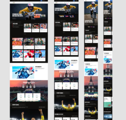
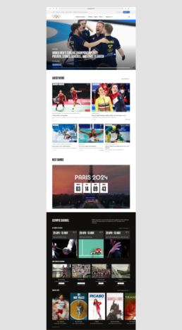
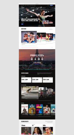
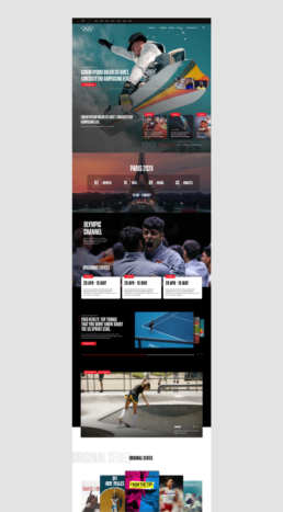
Homepage
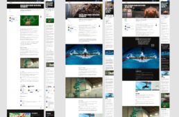
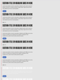
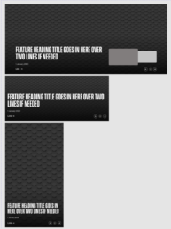
Article Page Types - Regular, Immersive, Hub
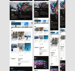
Athlete Page
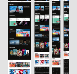
Olympic Channel Page
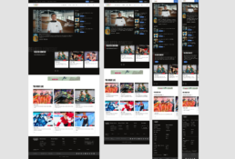
Olympic Channel Content page
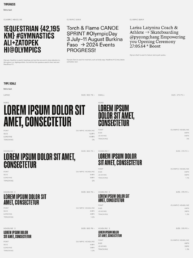
Foundations
The foundations are the bedrock of our design system, upon which everything else is built.
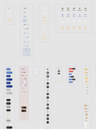
Atoms
Atoms the first level of functional components. An example of an atom is a button. A button without colour or shape is just text and without text or colour, is just a shape.
Molecules
Molecules are formed by combining one or more atoms. For example, the combination of a button, headline, and body text.
Organisms
Organisms are the most complex of our components. They are fully functioning and standalone, created when multiple molecules and atoms have been brought together.