Project Overview
Redesign Lido's website in line with their new brand guidelines
Lido Advisors is a private wealth management advisory based in the United States, with over $11 billion in assets under management. They have recently undergone a brand refresh, and have have asked us to help redesign their website.
Key Stakeholders
Shivani – Advisory Director
Blair – Chief Strategy Officer
Ken – SMD, President
Vivek – Chief Technology Officer
This Place Team
Jake Skully – Design Director
Myself – Senior Designer
Marina Mylonadis – Designer
Nick – Strategist
Sophie A – Senior Strategist
Discover & Define
An agile and iterative design & delivery phase within 5 weeks, supported by deep insights, regular project status updates, and client design reviews with feedback to ensure output is developed collaboratively with no 'big reveal' upon final delivery.
Business Goals
> New customer acquisition and support marketing advisor marketing activities
> Drive brand awareness
> Exceed customer expectations
> Drive portfolio consolidation
Target audiences
> Entrepeneurs
> Small business owners
> C-Suite executives
> Doctors and dentists
> Individuals who have experienced a liquidity event
Brand experimentation & layout designs
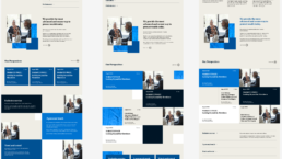
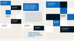
I really enjoyed working with this branding, as I really felt I could experiment, explore various creative routes, and push the limits of the brand for digital use. I explored the idea of using rails, and creating a grid system around this.
Various page layouts
After presenting various concepts, I then explored designs for the remaining pages of the site.
Final Designs
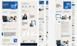
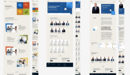
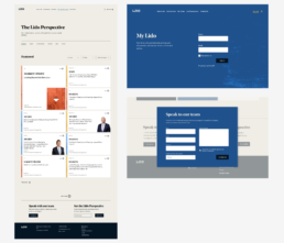
These are a couple of the final pages designed: Homepage, About Us, Our Services, Our Team, the Biography page, Our Perspectives, along with an intro screen of the My Lido portal. These are created in 3 sizes which are Large, Medium and Small. Swipe to see all the pages.
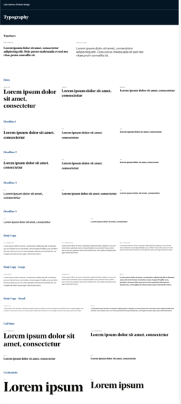
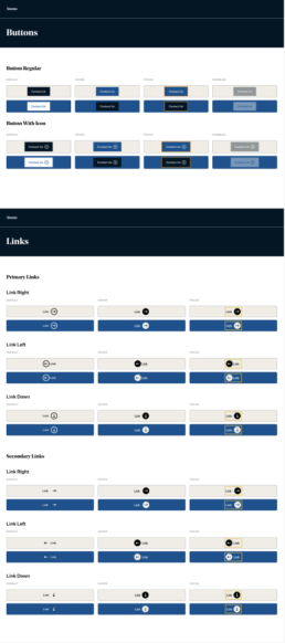
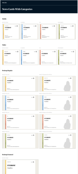
Build of the Design System
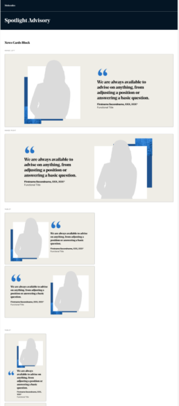
Components are the building blocks of a digital experience. Our underlying approach to design using the design system is called Atomic Design. Atomic Design categorises the components of a design system into three main groups: Atoms, Molecules and Organisms. Along with with we have the Foundations, which is the base level styling of all of our components.

