UX Strategy
Project Overview
Orpay is a food service app, a simple way to order meals either by delivery, pick-up or dining in from your favourite restaurants. The app core goal: ensure a quick and easy user journey for our customers and make ordering from Orpay a casual habit.
Scope of work
App design requires a holistic approach. That include niche competitor researching, creating an impressive and friendly user interface with focusing on how people interact with it.
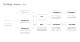
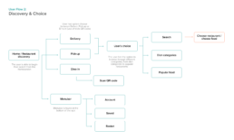
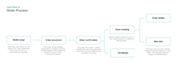
App Logic / User Flows
I have thought through several user flows and created 3 key flows that form the skeleton of the entire app.
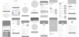
Wireframes
Wireframes were developed to better understand the feel and the structure of the application.
Branding
Design Systems
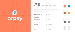
I wanted to create a friendly look and feel, using fun colours which also adhere to web accessibility standards.
To add to the friendly tone, I felt the use of a rounded sans-serif font would best reflect.
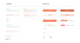
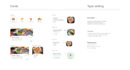
UI Components
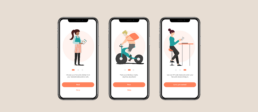
Registration
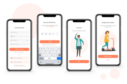
The user is prompted to register at the first launch of the app. There are just a few simple steps that the user has to take to start using the app.
Homepage
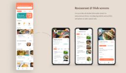
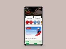
After registration is complete, the user is taken to the homepage of the application. It starts with promotional and Orpay deals to showcase all ongoing offers. The user has plenty of options to choose from food categories to tailored categories such as Top picks and Special offers.
Infinite scrolling
This offers an efficient way to browse restaurants without having to wait for pages to preload and makes the user stay longer on the page, increasing engagement.
Merchant campaigns
Ads will be visible through the homepage based on the users' search, showing the most relevant products, dishes or restautants.
Ordering Process
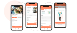
Once the user has chosen their ideal restaurant, they are only four steps away from ordering.

