Project Overview
Pressure Apple to adopt RCS in iMessage
Rich Communication Services is an open, universal technology developed by Google to allow a unified texting experience across mobile platforms. In other words, if you’re on a different OS than your friend, your texts still work the same, photos and videos share the same, group chats work the same, and so on. RCS is the new mobile standard for global messaging.
Client
Google, Android
This Place Team
Ben Aldred - Chief of Design
Jake Skully - Design Director
Myself - Product Designer
Aman Paul - Project Manager
So why are we here?
Apple hasn’t adopted RCS. They see iMessage as a useful lock-in tool for Apple consumers, preventing them from switching to Android devices. Apple’s “blue bubble vs green bubble” experience is intentional, and they’ve been happy to let that divide – and all the consumer negativity behind it – fester. Most of that impact (and related vitriol) is aimed at Android users by Apple users. Stories run rampant of Apple teens kicking Android teens out of friend groups, or iPhone users not dating someone who texts back with a green bubble, and of a general condescension towards Android users. Apple’s done a great job of making this all look like Android’s (and Android users’) fault.
But under the surface, there’s a simmering frustration with Apple among their own users about this topic. Apple Support pages run deep with people begging them to fix iMessage – so that they can see videos of their friends that aren’t teeny-tiny, so that they can escape group text threads with ex’s from years ago, and so on. Apple is intentionally creating a sub-par experience for its own users, and they’re noticing and complaining. Even worse, Apple is exposing their users to harm by keeping this model in place. When iOS and Android users text one another, iMessage downgrades the communication to the SMS (Short Message Service) standard – the original texting standard from 1992. SMS lacks much of the modern texting functionality expected today, including end-to-end encryption, meaning the privacy of all of these cross-platform texts is in danger.
What do we need to do?
Inspire iOS users to pressure Apple to fix this issue. Essentially, can we get them to eat their own?
Who needs to care about this?
Gen Z and Millennial iPhone users, with a particular desire to reach and influence high-profile Apple supporters, fanboys, influencers, and even activist stockholders.
How are we approaching this?
We are embarking on a content blitz to raise awareness of the issue. A programme of different content in different channels made by different creators will help amplify the issue.
UI Designs
Final Concept
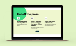
The site is a central hub for the conversation, providing context and access to other content out in the world in order to round out people’s understanding of the issue. We envisaged it feeling like a feed of the content out in the world and a place to learn more.
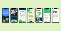
By following Androids look and feel and digital brand guidelines, I designed the below landing page for desktop and mobile.
Content Sections
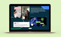
Content feed
A dense vertical scrolling feed of different pieces of content pulled from around the internet, embed directly into the page. These content types including Tweets, TikTok Videos, Youtube videos, IG Videos, Article links, Quotes.
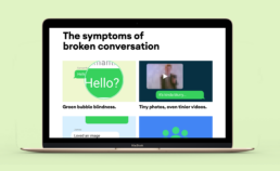
Symptoms of a Broken Experience
Demonstrating some of the user experience issues that apple users encounter so that they can notice them more readily.
The Messaging Landscape
A section that describes the overall messaging landscape and highlights various platforms. These include Facebook Messenger, Whatsapp, Signal, Telegram, iMessage and Snapchat.
The Solve
RCS a description of what Apple can do to solve the problem.
Thanks for all your hard work on this so far! We had a great meeting with the client on the page you've been working on and long story short, they are really happy with the design! So well done!
— Ben Aldred, Chief of Design at This Place
Hand off
Guide to Page Build Documentation
In order to send off our designs to the Google Development team, we created an interactive documentation which guides the developer around how the navigation works, flexible grids and copy interactivity.

